Monday, October 22, 2012

Cookin' Up Creations DT Work to share

*****This layout has been chosen to be the Layout of The Week*********

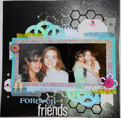
Last Saturday over at Cookin' Up Creations  I challenged the group to get Totally Layered and add a bit of Neon or a bright color along with a sketch (see below) to their project.

Here is the layout I created using the sketch and some neon colors and lots of layers.

Some close ups. Yes, that's mulberry paper, corrugated paper and vellum. I think it add a nice layer to things. Everything is on pop dots. All of the papers used are old from my stash except for the graph pointy speech bubble the is DCWV.


Here is the sketch from the talented people over at Creative Scrappers


Monday, October 8, 2012

Cookin' Up Creations DT Work Share.

If you saw an earlier post then you know that over at Cookin' Up Creations we're doing everything inspired by the 80's. The challenge I posted for the group was Mixed Tapes. It went a little like this.......

Hey Laaadddiieeesss! 

As we go back in time to the 80's, we are reminded of the days we created a mix tape for every occasion. You remember the tape for that special date, for studying, for riding in the car, or just hanging with friends. 

Today we're creating a new mix tape, Well sort of. We will be using washi tape to create fun design elements for our projects.For this challenge I would like you to use 2 or more washi tapes. You can use it as a simple design element, for a border, to adhere your photos or stamped image. You can even use it to create your title as I did here in my layout.

So, Get creative with your mixed tapes. I can't wait to see how you totally rock this one out.

Word to your mother!
MCA* (yes, this has been an homage to the Beastie Boys)


Here is the layout I created as the sample.


Circle of Friends
I used washi tape as a border(black & white dot), as embellishments in the left hand corner(neon diagonal stripe, black & white criss-cross and blue & white dot), and on the right hand on the bottom of my photo strip(neon diagonal, Blue floral and black & checker). As, well as on the mini polariod (black & white chevron).

Close-up of the title with several washi tapes to cover chipboard Thickers
COF Title

Wednesday, October 3, 2012

Let's Scrap DT Work to Share

I love this sketch and, I have to say, I love this layout I created based on the sketch.
This week on Let's Scrap the DT had to create a layout based on this sketch. I have to admit, I was a bit stumped at first then, it all just can to me. The kids loved it. I am not sure if they loved it because they got to climb the tree or because their dad and I did.

Here is the sketch from Let's Scrap. I only use the left side of the sketch.
This is the layout I made.
 I did the journaling around the page. It's reads:

You & I  planted a little seed nurtured it with love. That lovely little seed took root and sprung a little root and then another and yet another. We continued to nurture it. The root and the three smaller roots grew stronger. Over the years those roots grew into a sapling. We gave it more love, although the years haven't always been kind to the sapling continued to grew. We kept nurturing and sprinkling it with love. Until it finally grew into a strong and lovely Family with 5 strong brunches and 3 smaller branches. So Beautiful!

Here are some close-ups   


Around each photo and pattern paper I outlined and put our names. It reads like this: Fran & Annie = Kaitlyn, Rowynn , Liam, Us.


All the materials used for this layout came from the Scraptastic August's Barn Door Kit Club. Except for the Felt Cloud they came for Kat Scrappiness.

Sunday, September 30, 2012

Cookin' Up Creations Design Team Work Share

Over on Cookin' Up Creations the DT had to scraplift a member of CUC group. We voted and chose Jeanie Moler.  She created a lovely layout (see below).

Here is the layout I created. I did a lot of layering.

Jeanie's Layout
Image


Some Close-ups of the title and layers. 
(yes, you are seeing correct. 
That is vellum, mulberry and handmade textured papers in the layers)

 I traced Amy Tan's flower and colored it to match my layout.


Thanks for looking. If you decide to scraplift Jeanie or even me be sure to leave me a link to your creation.


Friday, September 28, 2012

A Big Thank You to PaperCrafts!

I received my prize from Paper Crafts Magazine. I won their July/August contest. I never thought I would win. I enter these contests all the time and never win. I am so happy to have won. I blogged about on August 24th DT work and More 
Here is what I received.


Everything laid out.
Lilybee Design Head over Heels
6x6 tiny tablet(36 papers -3 sheet of 12 designs) and stickers

Lifestyle Crafts Embossing Folders 
Classic (2 designs)

3 Set of Stamps
 Hero Arts clear stamps
Just A Note Set

Market Street Stamps
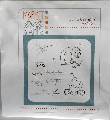
Gone Campin' (MSS-25)

Papertrey Ink clear Stamp set
Rosie Posie #2459
17 Images front
 back images

Martha Stewart  Craft Punch
Classic Butterfly

Fancy Pants Designs
Wave Searcher Collection

Showing all the papers, stickers, trim & buttons
(10 sheets of double sided papers, 1 border double sided paper
& 1 cut apart journal spots) 1 sheet of element stickers,
 1 sheet of Alpha stickers, 1 sheet Glitter Cuts

Basic Grey Oxford Collection

 Showing you all the papers A side and Stickers
(18 Double-sided paper, 1 Alpha sheet & 1 Sheet stickers)

Thank you so very much Paper Crafts Magazine and the manufacturers for this wonderful prize.

Thursday, September 20, 2012

Layout Share

Over on Cookin' up Creations we're doing the Great Outdoors theme this month. Barb issued a challenge called Sand and Water. For this challenge she wanted you to create a project inspired by sand and water.

This is what I came up with. I did a lot of layers and clusters. In the picture is my eldest daughter when she was 2 years old. DH made her a Sand Mermaid and she was in heaven. She loves mermaids.


Close up of the clusters.


Monday, September 17, 2012

Design Team Work Share

I had a wonderful weekend with our kids and their friends. We celebrated our son's birthday early. It was a movie themed party. The girls and I decorated with streamers, movie posters, and movie themed die cuts. We gave out popcorn bags filled with movie candy and popcorn. Then the kids went to the movies to watch ParaNorman. They love it! When they returned we did the cake and other festivies. I'll post pictures in a bit.

Now, for the Design Team Work for Let's Scrap. I created this layout of my children meeting their baby cousin for the first time.


I kept it simple - I did exchange the doily for a heart and create a polariod style picture instead of a round one. As shown in the sketch.
All the papers I used  except for the cardstock base were from the Scraptastic July's Nostalgic Summer Kit.