Wednesday, September 5, 2012

Join Us.....

This month on Cookin' Up Creations we are enjoying the Great Outdoors!


We will be doing challenges focused on all things outdoors! We already have a few challenges posted. 

Challenge # 1 Explore Use the enclosed sketch along with the word explore to create a project.

Challenge # 2 Sand and Water Use sand & water as inspiration to create your project.

Challenge # 3 Ribbon Use 2 different ribbons to create an outdoors - inspired embellishment.

More challenges are coming soon. This month's Sponsor is the Flying Unicorn!


Blog Candy

Fellow Design Team member Jennifer is having a Blogiversary and has a giveaway going on her blog. Here is a link to her blog Scrapin' Expect the Unexpected She is an amazing designer. So, stop by show her some love and check out her amazing layouts and cards. Let's support one another!


Friday, August 31, 2012

Layout to Share

I created this layout for a challenge on Cookin' Up Creations.  Tunnel of Love -  You had to create a layout of someone you love. So I chose my handsome husband of course.

Love

The journaling reads: I feel like I've been in love with you for a thousand years. If we believed in living many lives I know that I will always be your wife and in love with you. I hope we will be together for a thousand years. If not may we be together until God calls us up to heaven. Where I know we will be together and ever in Love!

Products I used:
Cardstock - Teal, Dark Red
Pattern Paper: My Minds Eye - Striped, Heart, Arrow & Flowers - Adore collection, Brown & Teal - Bohemia Collection, Dark Red Floral - DCWV,
Stamps: I love you, heart with arrow & 4 hearts - Studio G Love, Love, Love - Basic Grey
Ink: Brown - Studio G & Black Ranger Archival
Pen: Black - Zig Milliennium
Adhesive - ATG - Scotch
Wood Veener - Woodsies

Friday, August 24, 2012

Sharing Design Team work & more

This week on Let's Scrap the design team was assigned the following sketch to create our projects. I hope you join us and create a layout based on this sketch. Join the group lots of fun challenges and inspiration.

Sketch 8-22-12


Here is my layout.My daughter had a Minni Mouse them birthday. The pictures are of her and her brother & best friends.


Now, If you saw my last post I created a layout for a challenge issued by Cheri Scrappinnwrappin on youtube.  
So Cheri issued a challenge to create a layout using the following guide lines:

1. Use a white background
2. Splatter (mist, paint or ink - your choice)
3. Use Thickers or any dimensional letters
4. Outline your base and papers
5. Use paper layers (pattern or solid - your choice)
6. Ink your edges
7. Use only one photo highlighting a happy moment in 2012
8. Use a Flair or wood veneer


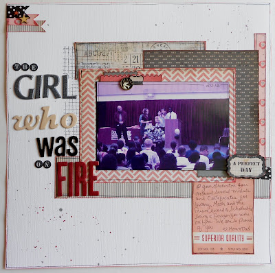
Here is the layout and some close ups. I did a play on words for the title. It's a quote from my daughter's favorite book the Hunger Games and her school mascot - The Dragons. When the students achieve greatness at the school they say your on FIRE. On these day she was on FIRE. She received several awards and a Scholarship for outstanding math student for our county. She loves math, science & history. She is amazing. We are very proud of her.

 Close up of the title and other elements of the layout.


Now for the more. Today I received a letter from Paper Crafts Magazine. I had entered their giveaway in July/August and I never checked by to see who won. Well, it turns out I did! I won a very sweet prize. I have to send them some info and my prize will be here in a few days. 7363178730 a0ae8cdd7f July/August Sweepstakes Comes to a Close
From the picture it looks like I won the following:
Basic Grey - Oxford Collection
Lillybee design - Head or Heels 6x6 paper pad and banners
Fancy Pants - Wave Searcher Collection
Martha Stewart - Butterfly punch
Hear Arts Stamp
Market Street Stamp - Gone Camping
Lifestyle Crafts Embossing Folders
Papertrey Ink

I am so excited about this. 

Thursday, August 23, 2012

My response to Cheri aka ScrappinWrappin's Challenge

I made my first youtube video in response to Cheri's challenge for her 1500 subbie giveaway. Here is a link to her channel ScrappinnWrappin

So Cheri issued a challenge to create a layout using the following guide lines:
1. Use a white background
2. Splatter (mist, paint or ink - your choice)
3. Use Thickers or any dimensional letters
4. Outline your base and papers
5. Use paper layers (pattern or solid - your choice)
6. Ink your edges
7. Use only one photo highlighting a happy moment in 2012
8. Use a Flair or wood veneer

The products I used were the following: White, Gray Metallic & Black Cardstock - Bazzil, Pattern Paper: Chevron & black gray dot, Strip & Roses all MME Nostalgia Collection, Grid paper with multi type is Prima Romance Novel Collection, I fussy cut the small tab & word from the Prima Romance Novel Collection. Washi tape K& Co. Black with white dot, Mister Huey Pinstrip & Plum Thumb, Grid stamp Kaiser Craft, Wood Veneer - Stars - Studio Calico, Letters: Thickers, Momenta and Miss Elizabeth. Ink Ranger & Studio G, Pen: Precision Pro American Crafts.

I will post pictures later on.

Wednesday, August 22, 2012

Doodlebug Giveaway!

If you haven't hear Doodlebug is having a giveaway. Here is the link Doodlebug giveaway. Follow the simple instructions for your chance to win.

I love this one layout the little ghost are so darn cute!


So what are you waiting for go enter!


Monday, August 13, 2012

Some Layout to Share

So, today I am having a slow kind of day. To much fun enjoying my daughter's birthday party this weekend. I wanted to share a few layouts I created for design team work for both Cookin' Up Creations and Let's Scrap.

For Cookin' Up Creations - we are doing for the month of August -Amusement Park Theme. Catch up on all the challenges on the forum or stop by The Cookin' Up Creations blog to be inspired.

I challenged the group to create their own tickets. I posted a tutorial here on the blog ----> Ticket Tutorial.

Then on Saturday I challenged the group to use those tickets along with this sketch to make a layout. (I can not remember where I found this sketch I believe on Pinterest - So, I can not give credit to the creator, which makes me sad).

Here is my layout for this challenge.
Here is a close up of the tickets, title.


Now, for Let's Scrap DT Work. On Friday I posted a challenge for the group to use an Advertisement for inspiration. I used this wonderful one by Graphic 45. along with a sketch from the site.

I use this sketch created by Cheri O'Neill

I fell in love with the color combination.  I thought it went well with the photos of my girls when they were younger. I only use the left side/page1 of the sketch. 

I created this layout Sister Book Adventure(actually I made 2 of them, same layout for each of the girls)

I also created this layout of my son and his best friend for a challenge posted on the Let's Scrap site called Flip It. The Challenge was issued by Judy a fellow DT member. For the challenge you had to use a sketch from the site and flip it.

This is the sketch I used (it was created by Cheri O'Neill). I only used the left side/ page 1. I flipped it 90 degrees.

Here is my layout. Titled The Guy Files.
 Close up of title and embellishment.


I've been busy creating some layouts and cards. I'll be sharing those soon. I hope you join both groups for all the fun and challenges.